


HOGA ( HOUSE OF GENTLE ARTS)
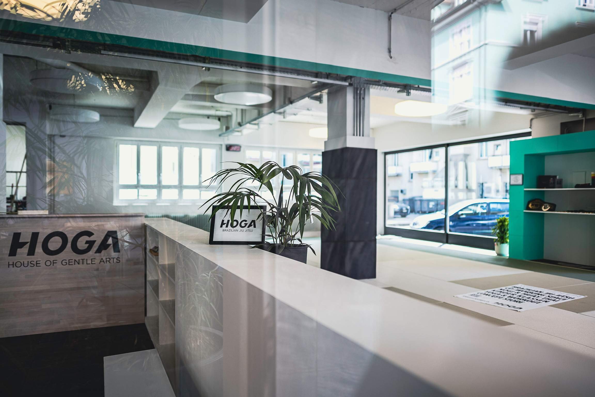
Scope: Unlike other martial arts gyms HOGA wanted an inviting, friendly appearance that welcomes kids and families. A Brand that attracts the everyday person and does not intimidate or feel dangerous to possible new members. This meant no angry faced animals or aggressive fonts that would communicate like other gyms.
Jiu Jitsu is considered one the most complete and efficient Martial Arts in the World. It adapts techniques to real life scenarios proving any individual that someone doesn't need to be strong, fit or in shape in order to be able to defeat a bigger and stronger opponent by applying concepts such as leverage, timing, weight distribution and technique over strength.
The logo they chose is a sporty modern font I drew, combined with pastel colours. This combination of font and colours allows them to play and find the best fit for the task at hand.
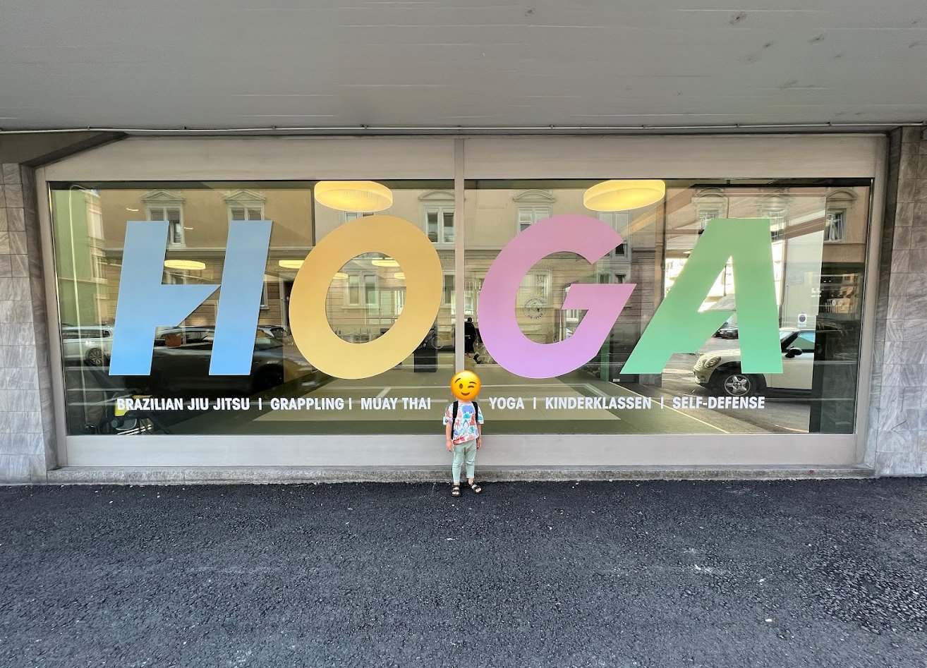
HOGA gym window branding in Zürich, Switzerland
Albino et Preto is a big name in the BJJ scene, and I was very excited to design a custom Kimono exclusive for the HOGA academy. I used the brand colors to create a friendly patch inside the clothing and a slogan the coaches like to tell the students: STAY CONSISTENT.
On the outside I used the logo letter H in a 3D manner to show how many layers the sport has and how you will advance if you “stay consistent”


Graduation

At some point a member of the HOGA family who has reached their next level of Jiu Jitsu will graduate to a new colour belt or stripe on their belt. For this I designed the academy certificated for adults and kids.

